Visualizing Output
After you have run the model, there are three ways to visualize the outputs. You may rely on the set of graphs that are built into the Energy Policy Simulator (EPS) (which appear on various sheets of the model), you may generate graphs of any variable using Vensim, or you may copy tabular data and import them into another program, such as a spreadsheet, before graphing them there.
The EPS's Built-In Graphs
The EPS includes many graphs, which are listed on the Output Graphs Available in the Web Interface documentation page. The specific variables shown on these graphs, as well as the graph style (line or stacked area, sometimes axis scale) have been pre-selected and cannot be changed using Vensim Model Reader.
Once the model has been run, the data from the topmost currently-loaded run (generally the most recent run) will always be shown in the built-in graphs.
No special technique or controls are involved in analyzing the data on the built-in graphs. It may be helpful to zoom in on some of them. This can be done by holding down the "control" key and rolling the mouse wheel up (while the mouse is hovering over the main view in Vensim Model Reader).
Producing Your Own Graphs in Vensim
After the model has been run, you may click on any variable to make it the active variable. That variable's name will appear in the title bar for the Vensim Model Reader window after the model's filename. (The title bar will read approximately "Vensim:EPS.mdl Var:[active variable]".)
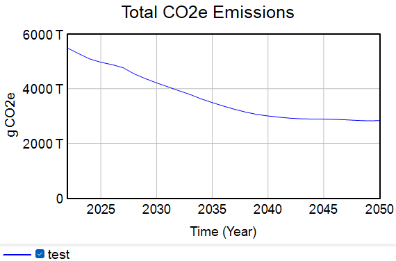
Navigate to the "Cross-Sector Totals" sheet and scroll to the top left. Click once on the "Total CO2e Emissions" variable to make it the active variable. Then, click the "Graph" button on the left side of the screen.
![]()
A graph showing total CO2e emissions appears in an output window, as shown below. You can drag any edge to resize this window. A menu bar includes options such as locking the screen and copying the graph.
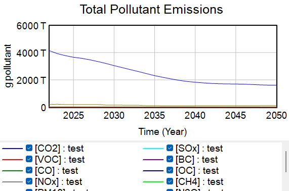
You may graph a subscripted variable. Click on the "Total Pollutant Emissions" variable, then click the Graph button. A graph appears, and the key indicates twelve lines are on the graph- one for each of the twelve pollutants in the model. However, most of the lines are stacked on top of each other near the X axis, because CO2 emissions are so much larger than the emissions of other pollutants. The graph may look similar to the screenshot below, where only CO2 and F gases (which are represented in CO2e terms) are visible above the X-axis:
In order to see the other lines, it is necessary to hide the lines for CO2e and F gases, so Vensim selects a Y-axis scale that allows more lines to be seen. Click the "Subscripts" button near the upper right of the window:
![]()
This opens the subscripts window. This window allows you to toggle the display of various subscript elements off and on. If it is not already active, click on the subscript option titled "Pollutant 12/12". The window should look like this:
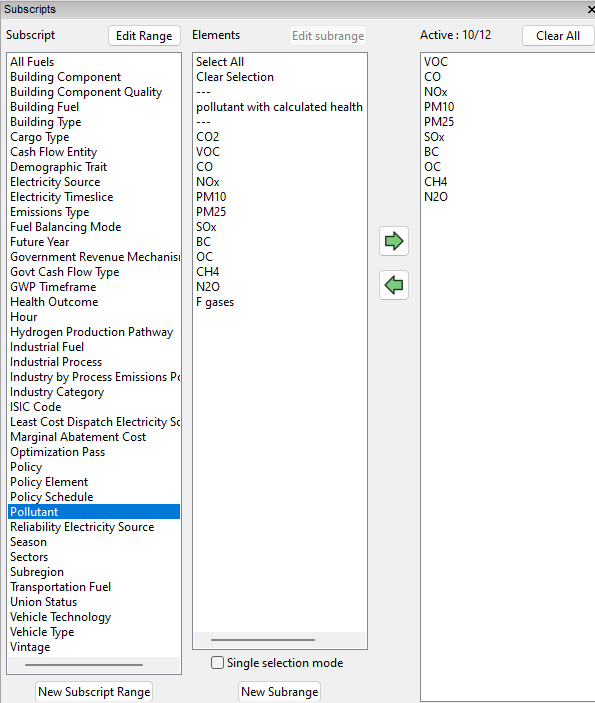
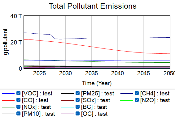
Click on the "CO2" and "F gases" rows and use the green arrow to de-select them. The "Active" status changes to "Pollutant 10/12". Close the subscripts window, then click on the "Graph" button again. (If "Total Pollutant Emissions" is no longer the active variable, you will need to first click it to make it active again.) Now the Total Pollutant Emissions graph only has lines for ten pollutants, and many more of them are visible above the X-axis. It should look similar to the following screenshot:
Copying Tabular Data for Use in Another Program
Graphs generated on command in Vensim Model Reader can be good for getting a quick sense of a variable's behavior, but the graphs seldom look very good and are not customizable. Often, it is best to copy the data in tabular form and graph it in a program that provides more options and produces nicer-looking output, such as Microsoft Excel or another spreadsheet program.
To do this, select a variable, then click on the "Table" button on the left side of the screen.
![]()
A table appears that includes all of the selected variables. Here is a screenshot of the Table window showing data for the "Total CO2e Emissions" variable:
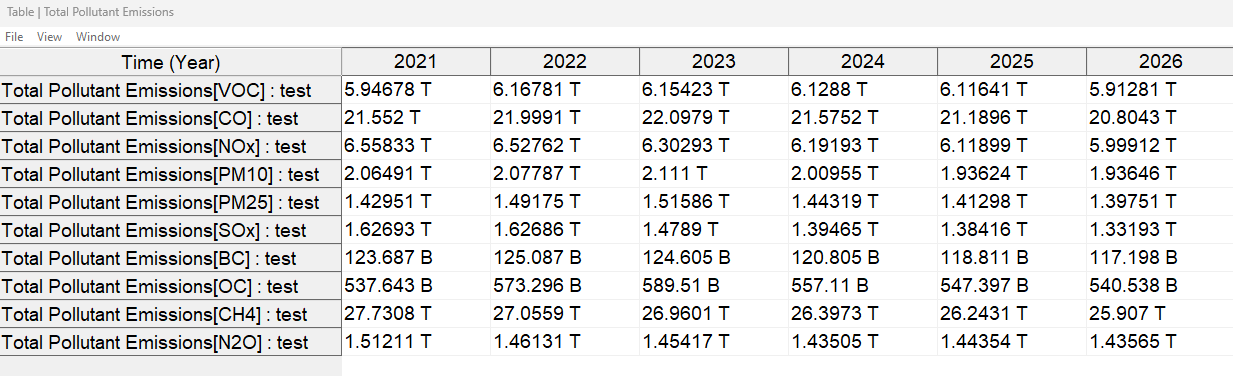
By default, Vensim displays values in "Pretty" format, which uses "M" for million, "B" for billion, and "T" for trillion, etc. While this may be useful for evaluating the relative magnitude of variables, "Pretty" format is not readable as values in a spreadsheet program. To change the number format, right click on the Table button and select "Tool Option," then "Scientific" instead of "Pretty" in the "Number format" selector. Now, tables will display all values in scienific notation.
You can include variables on more than one Vensim sheet in the same table by adding the variables to the table sequentially, without closing the table in between variables. For example, select one or more variables on the Cross-Sector Totals tab, click the "Table" button, and then left-click in the main Vensim window. The table vanishes, but it has not been closed- it is simply behind the main Vensim window. Now, switch to another sheet. Select one or more variables and click the "Table" button. The existing table will be brought to the front and the selected variables will be added to the bottom of the table.
Once you have the variables you want in the table, you can use the View option from the menu bar to copy the values, or you can click on the "Time" box in the upper-left to select all data and copy using the ctrl+C keyboard shortcut. Alternatively, you can select and copy only certain rows or columns of the table. Now, open the program you wish to use for analysis or graphing, such as a spreadsheet program, and paste the data in from the clipboard. If your analysis or graphing program will not accept pasted data directly, you can instead use the File option on the menu bar to save the data as a text file (again, as tab-separated values), then open that text file in your program.
This page was last updated in version 4.0.4.